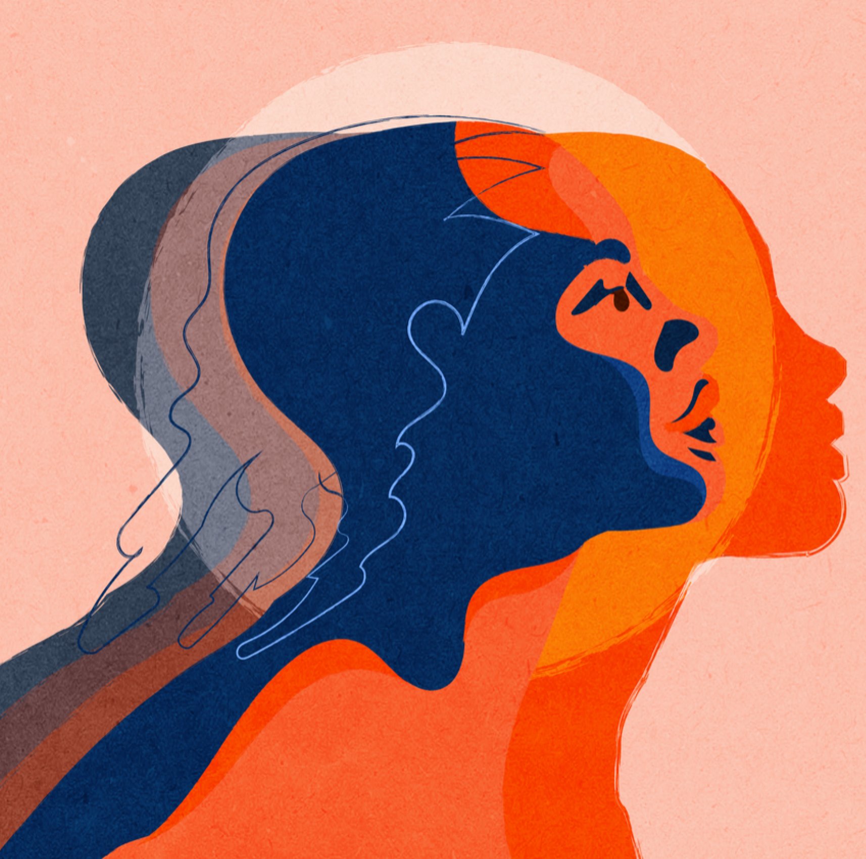
Embody is the privacy-forward period tracker you’ve been waiting for.
Currently in development and about to launch as the first truly private period tracking app on the market, I had the absolute honor of working with the Embody team to created the logo, brand, and initial brand guidelines.
Illustration by Neka King
Atlanta based photographer Bailey Garrot creates vibrant food and lifestyle imagery. We collaborated to create a visual brand that compliments her style, creativity, and personality while also positioning her as a seasoned (no pun intended) professional within her industry. The resulting identity features bold graphic type balanced by custom illustration.
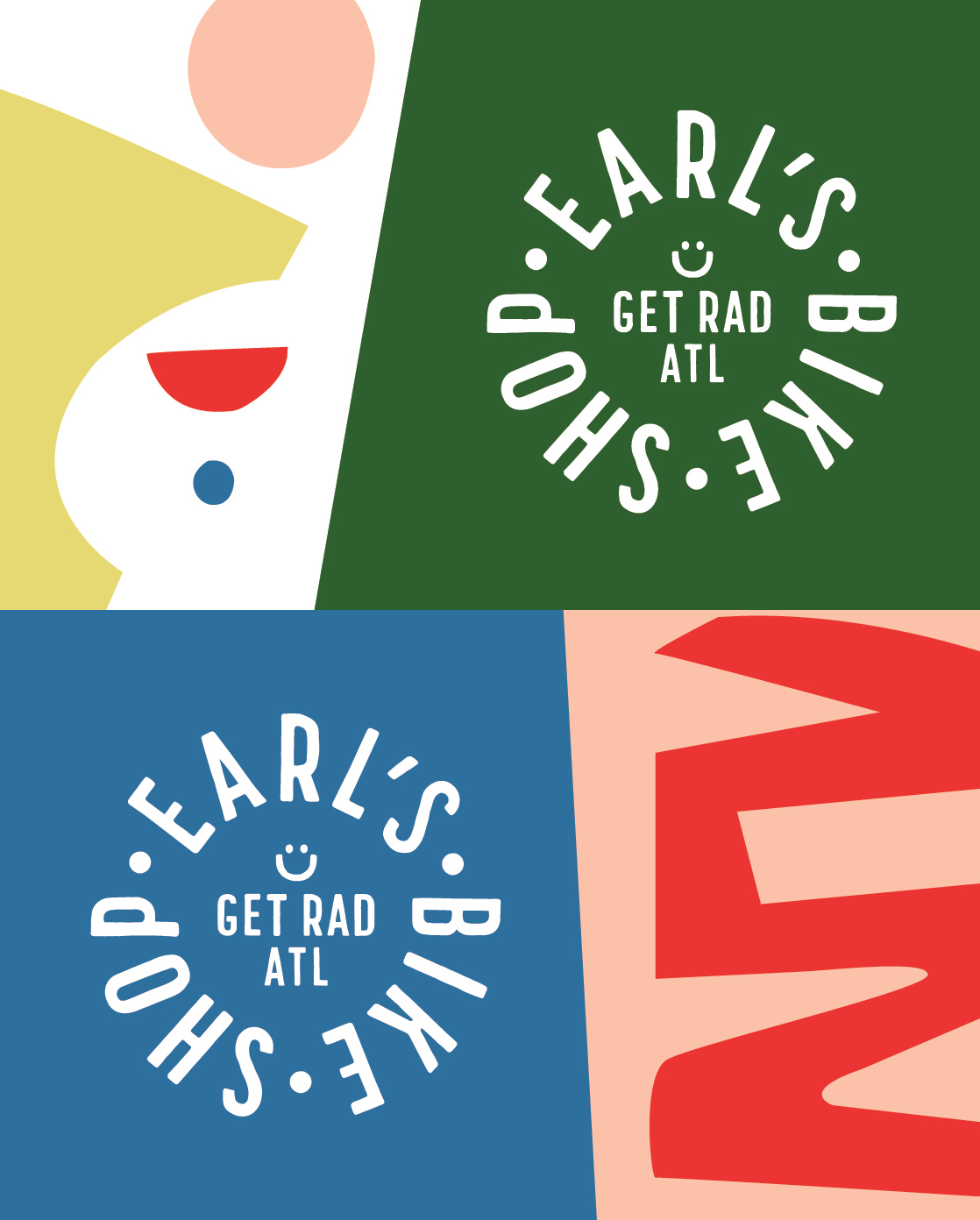
Founded out of a passion for cycling and a love of people, Earl's Bike Shop is a small business with big heart. Riding bikes is joyful, and the logo and brand needed to reflect that!
Initially I designed the logo, and then joined the business to help with daily operations, managing staff, purchasing product and more.
Drunk Lunch (RIP) was a design forward retail space in Madison, WI. With a fun name and owners with impeccable taste the logo needed to be exciting, creative, and unique. Designing and installing the mural on the back wall of the store was one of the many highlights of this project.
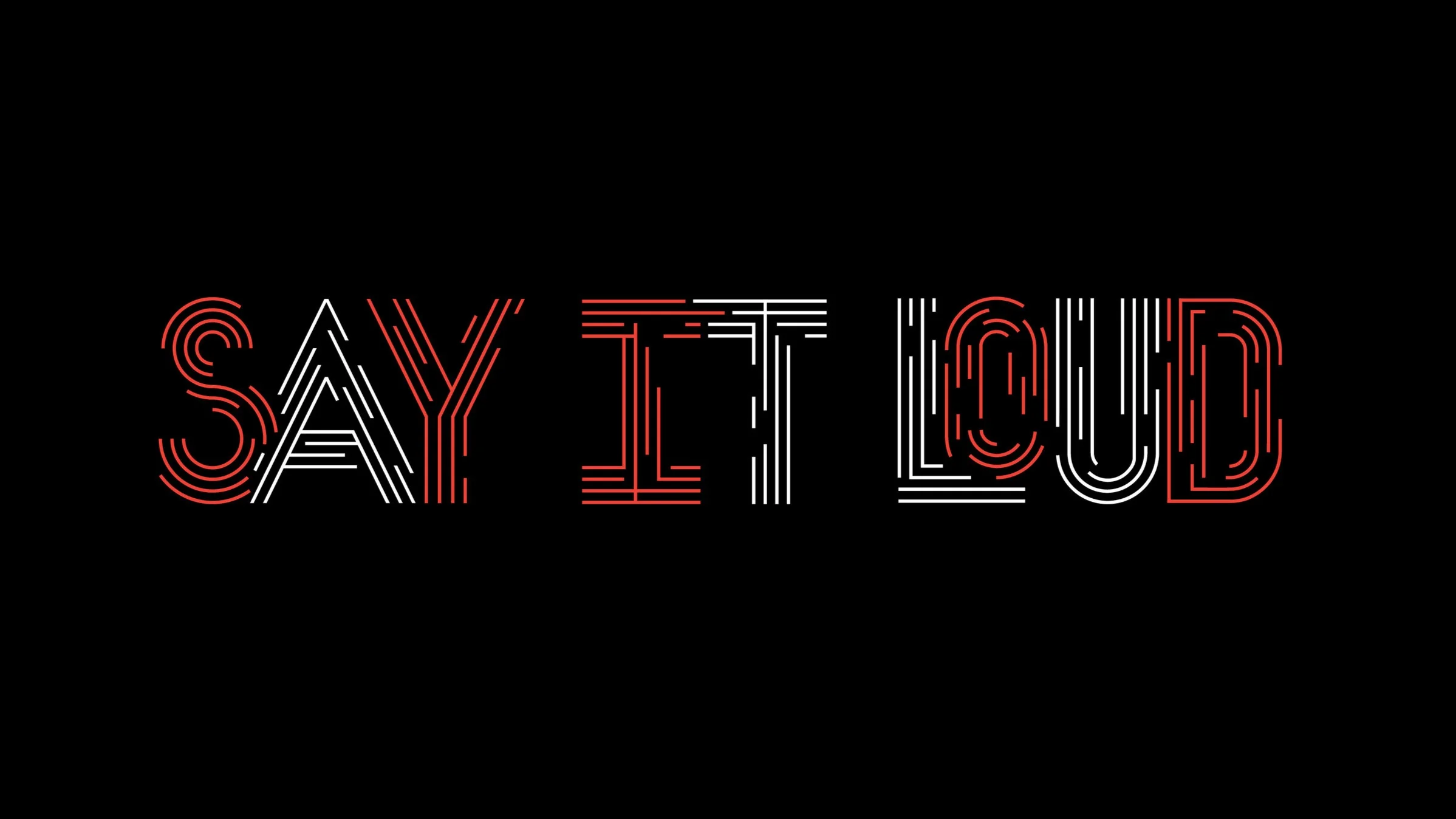
Another year, another season of extraordinary programming at the Apollo theater. After seeing an increase in ticket sales from the 2017/18 season, Apollo hired RED once again to create a design for their yearly catalog of performances. We created a custom typeface for the ‘18/‘19 theme that captures the high energy programming Apollo is known for.
Created while working at RED Partners
Role: Lead Designer
Art Director, Sam Eckersley
Good Day Shop is a home and lifestyle shop in Madison, Wisconsin. They came to me needing a logo and brand that reflected their commitment to the handcrafted and beautiful. The result is custom type created for their word mark, and an elevated brand with a touch of quirk cool.
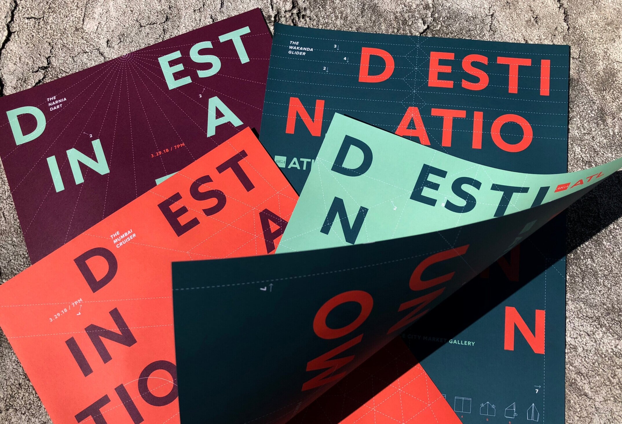
We were thrilled when AIGA Atlanta asked us to do the branding for the 2018 Poster Show, one of the chapters most popular events and fundraising. The theme was “Destination Unknown”, and designers were challenged with the question “If you could go anywhere, where would it be?”. A call for entries went out to the community, 110 posters were designed and submitted, and the selection committee got to work choosing their favorites for a one night exhibition at Ponce City Market.
Role: Design Lead
Created while working at RED Partners
Art Director: Sam Eckersley
Junior Designer: Lindsey Willis
The Northside Festival is a summer event in the heart of Williamsburg, Brooklyn that explores the future of music, innovation, and content. We partnered with Civic Entertainment Group to help TNT headline the festival and promote their summer programming. We transformed the bar Kinfolk 90 into the TNT Backstory Studio — an intimate and cool setting spotlighting unconventional storytellers across performance, art, fashion, food and music. The campaign featured a collage of artists’ posters, commissioned by TNT, to promote their summer programs.
Totaling 27 themed events over 4 days, the project earned over 32 million media impressions.
Role: Senior Designer
Created while working at RED Partners
Art Director: Sam Eckersley
Junior Designer: Lindsey Willis
For 16 years, Atlanta’s Candler Park has hosted its annual Fall Festival featuring local music, art, and food. In 2016, they added hot-air balloon rides to the event. Developing on the identity, we thought it would be fun to reference the euphoric feeling you’d get while floating high in the air, above the crowd.
Role: Lead Designer
Created while working at RED Partners
Art Director: Sam Eckersley
Junior Designer: Lindsey Willis
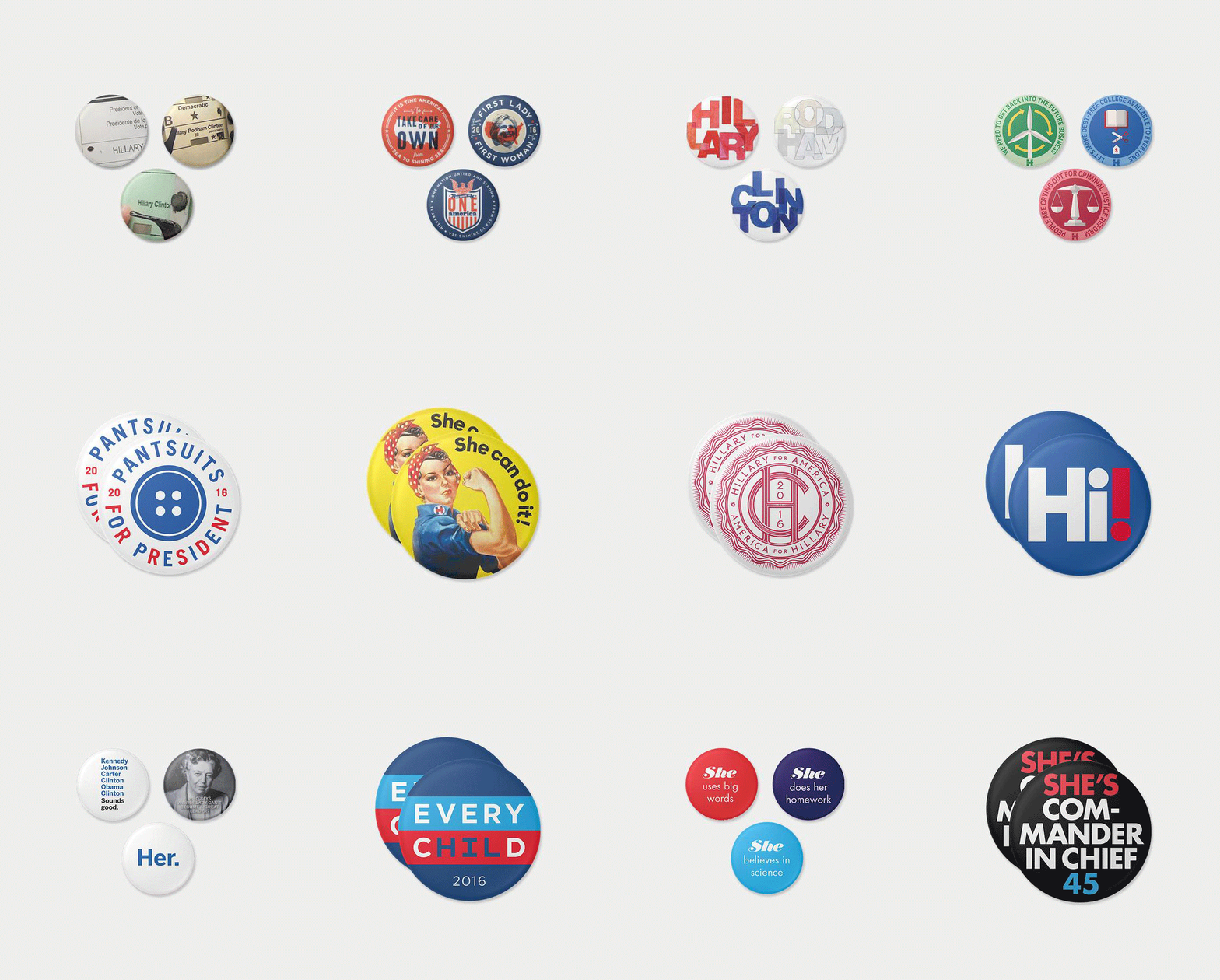
The 45 Pins Project was developed to raise funds during the Hillary Clinton Presidential Campaign. Each of the 45 contributors were asked to create a button design that embodies why they support her campaign. The pin we designed reflects Hillary’s “Every Child” initiative to improve and equalize funding in the public school system.
Created while working at RED Partners
Art Director, Sam Eckersley
While working at RED Partners, I had the pleasure of leading a brand refresh with America’s National Ballet Company during a time of transition and change. With a new Executive Director at the helm, the company wanted a fresh perspective on their visual brand. While assessing their assets, we noticed inconsistencies in the way the brand was being presented across different departments. Creating a style guide was a step towards building a more cohesive brand voice.
Role: Lead Designer
Created while working at RED Partners
Art Direction: Sam Eckersley
Looking to expand their audience, the Apollo Theater’s 2017/18 season featured new ticket subscription packages and an amazing + unusual mix of performances, including music, theater, opera, comedy, and dance. To clue patrons into the new offerings, we developed a unique look that stood out from the Apollo’s standard brand — creating illustrations generated entirely by paint and marker. Using bold, familiar colors, the campaign feels like the Apollo, but stands out as a campaign and season unlike any other.
Role: Lead Designer
Created while working at RED Partners
Art Director: Sam Eckersley
Junior Designer: Lindsey Willis
Illustration: Stuart Rogers
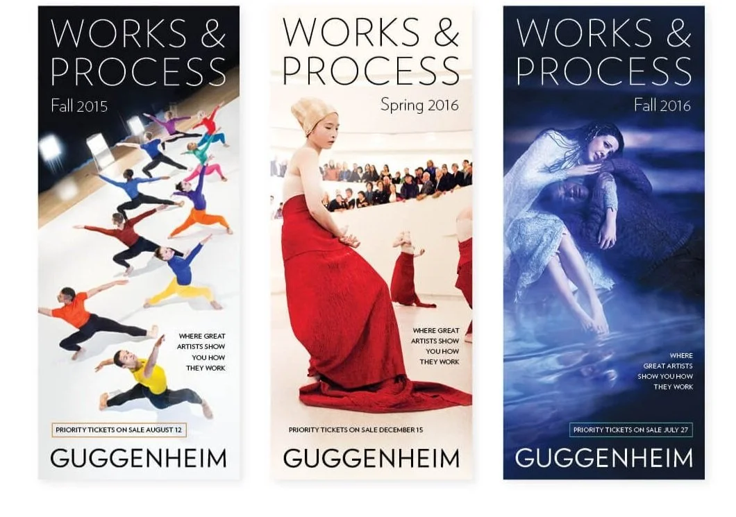
Works & Process is a performing arts series put together by the Guggenheim. Twice each year, the program brings in world-renowned creators and performers to showcase their new works and offer audiences the opportunity to explore artistic creation through conversation and performances. Each season, we develop the campaign and produce an array of media that helps promote their line-up.
Role: Lead Designer
Created while working at RED Partners
Art Director: Sam Eckersley


